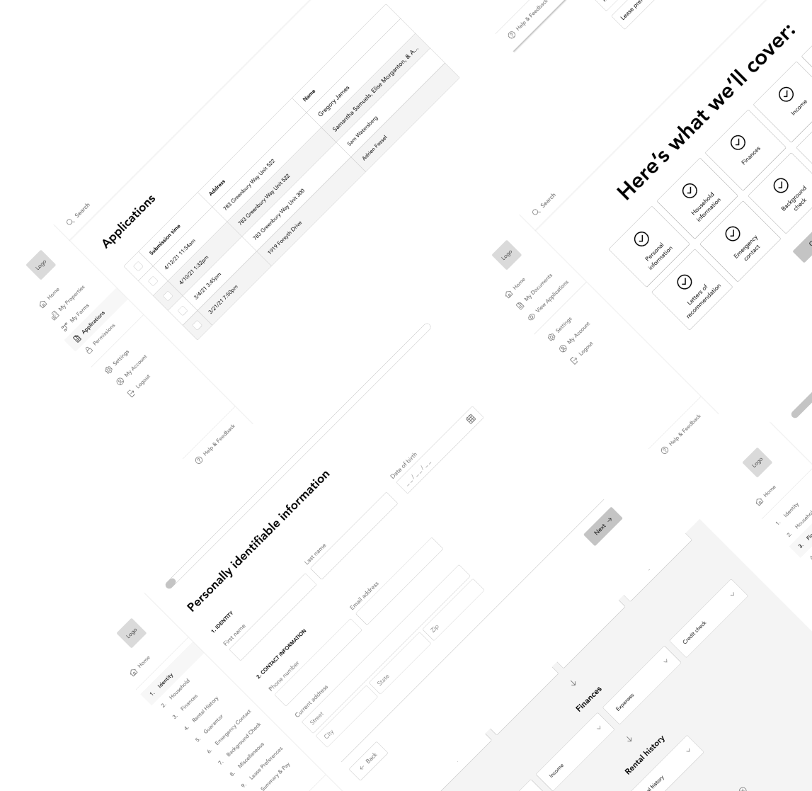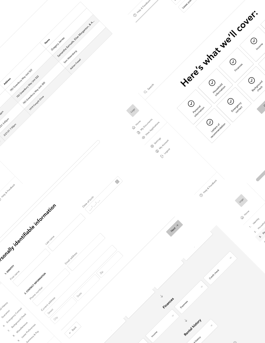

From July 2021 to August 2021 I worked with a back-end software engineer to develop a proof of concept app to demonstrate feasibility for an idea surrounding the rental application process.
"I am a software engineer by training building a real estate application tool. I need you to create low-fi/med-fi wireframes to flesh out the workflow. My expectation is that you'll not only create the wireframes, but also consult and advise on optimal workflows. I envision there will be a lot of back-and-forth conversations to iteratively improve the overall design."
As a prospective tenant, applying for an apartment or a house can be a convoluted process as each rental agency and landlord have their own forms and requirements. The problem can be exacerbated if you are moving to a new country, have accessibility concerns, or are renting in a busy city where you may need to submit dozens of applications.
As a landlord, it can be difficult to keep forms up to date, create new ones, and keep track of all incoming applications. This problem becomes more of an issue the more applications you receive.
A real estate application tool that consolidates this process into a step by step form similar to tools like TurboTax while also allowing users to track places they've applied to and the status of an application. For landlords, this tool will allow them to edit and update forms as needed and view the status of different properties and applications.
"Reid was punctual to meetings, asked pertinent questions to clarify expectations, and completed all his tasks on time. The output of his work was also of the highest quality. I look forward to collaborating with Reid again on any projects requiring UX/UI design work in the future."
My Contributions
Researching competitors, Developing user flows, and Designing wireframes
Duration
July 14th, 2021 - August 24th, 2021
Tools
Figma, Google Docs
Click a box to skip to a specific section or keep scrolling to start from the beginning.


Secondary Research Paper
Secondary Qualitative Accounts
Surveys
Affinity Mapping
Personas
Google Mapping Sheets
Problem Statement
Severity Ranking
Journey Mapping
Content Strategy
Prototyping
MVP
Usability Testing
A/B Testing
Usability Testing
|---------------------------------------------------------- 2 weeks ----------------------------------------------------------|
Since this was a basic proof of concept project with a small budget, we were unable to spend time interviewing users and developing a deep understanding of the varied experiences of renting an apartment (for instance, there may be different pain points for international students verses for a family moving within a city they already live in). Instead, we relied on our own experiences, with the understanding that users would eventually be integrated into the process after the proof of concept was developed.
Luckily, since I had just finalized a lease on a new apartment in a new city, it was easy for me to use my recent experience to inform potential design decisions. My search started about 2-3 months before I needed to move (posts on forums like Reddit and Quora suggest 30-45 days) and took about a month from start to finish. Granted, I had some flexibility on when I had to move, so I was pickier at first, but I'd estimate that I sent around 30 to 40 "requests" for an application. I searched Zillow, Apartments.com, Craigslist, and Facebook, but ultimately found individual agents to be the most helpful as they were able to send me lists of apartments that were currently available.
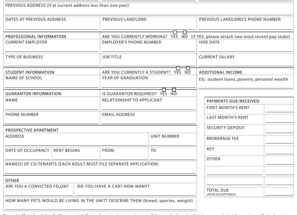
Once I found my apartment, I was sent a cluttered one-page document that I filled out and signed via Dotloop. The document had many issues, including:
Here's a screenshot of part of the document:

While I had other questions about the form (such as at what threshold would someone need a guarantor?), I decided to fill out what I could, submit it, and hope for the best.
After this, I was then sent an 8 page lease that went through multiple revisions (each with "newer" file names) and I had to email private information (like bank statements and photos of my driver's license) to someone I'd never met. I also had to fill out a couple of additional forms, some of which could be submitted via Dotloop while others had to be printed, scanned, and emailed back. All in all, this experience felt more convoluted than my past experiences renting an apartment.
Before designing wireframes, the client and I collaborated on an outline of what we thought the process of applying for an apartment would be like for a tenant and what functionalities a landlord or rental agency might require. These diagrams focus on the experience for 3 basic users: prospective tenants, individual landlords, and rental agencies.
From this information, I created two user flows (these are purposely illegible for client confidentiality)
Part of the client's inspiration for this project was to move landlords and rental agencies away from cluttered one page forms and instead towards something that was more user friendly like Turbotax.
Once we decided on the design for a couple pages, it was easy to flesh out the rest of them. Overall, I designed over 120 pages.
Our design decisions for the landlord/rental agency portal were influenced by the clients backend software engineer knowledge and the desire for something that would be quick to build. Thus, many of the pages have a grid view of properties, applications, and forms, while the "create a new form" page has a more extensive design.
In the future, companies like Apartments.com and Zillow could be a good resource for inspiration for how we could organize properties and show applications.
"Reid was punctual to meetings, asked pertinent questions to clarify expectations, and completed all his tasks on time. The output of his work was also of the highest quality. I look forward to collaborating with Reid again on any projects requiring UX/UI design work in the future."