

Secondary Research Paper
Secondary Qualitative Accounts
Surveys
Affinity Mapping
Personas
Google Mapping Sheets
Problem Statement
Severity Ranking
Journey Mapping
Content Strategy
Prototyping
MVP
Usability Testing
A/B Testing
Usability Testing
|---------------------------------------------------------- 2 weeks ----------------------------------------------------------|
|---------------------------------------------------------- 2 weeks ----------------------------------------------------------|
How to make being on the trail recognizable.
How to make it clear where the trail goes, how to follow it.
How to indicate what comes next, what is nearby.
How to create an identity of the trail as an experience while being on the trail.
How to make people want to move forward along the trail.
How to enhance and create attractors to facilitate trail exploration.
How can the trail be like a book that a visitor reads while walking along the trail.
How can the trail become an active and participative experience?
Experience through participation and experimentation.
Possible reuse of existing and old structures for new purposes.
How can pop up interventions, seasonal and occasional events create momentum along the trail.
Experiential learning of history along the trail.
How to leverage points of interest along the trail besides the core sites.
How to integrate "hidden gems" along or nearby the trail in the visitor experience.
How to integrate local businesses and amenities.
Next, we met with the Mayor of Quincy and the President of the Quincy Chamber of Congress to learn more about the significance of this trail and the current status of the project.
Existing trail infrastructure included maps/brochures, some historical signage, advertisements on trash receptacles throughout the trail, and the placement of wayfinding decals also throughout the trail.
Pictured below are two different types of signage that can be found throughout the trail. As shown in the first photo, the map of the trail in the brochure was quite different than the one displayed on the Hancock Adams Common signs.
After meeting with the Mayor and the President of the Chamber of Commerce, my group created an interview guide and spent the rest of the afternoon speaking with locals, tourists, and volunteers to learn more about their experiences with the trail. We interviewed a total of 6 people.
Key insights from field research:
Current awareness of what is on the trail is low. Residents and visitors are not aware of the existence of the trail - what they can do, why they should do it. In general, the local residents we talked to were aware of some of the historical sites but did not seem interested in walking the trail.
“When they ask me what to do, I hand over the map. But it's not enough for people to navigate.”
- Volunteer 1 at Church of the Presidents
“What are those blue signs?”
- Local Resident 1
Doesn’t know much about the presidents trail but is aware of some of the historical sites in Quincy.
- Local Resident 2
Visitors want to choose their trail route and length, and want to know the distance between sites so they can make an informed decision based on their time constraints and physical abilities.
“We were afraid that the walking speed at the Freedom Trail tour was going to be too fast for us. So we chose the audio tour instead.”
- Elderly couple visiting from Oregon
"I don't have time to walk the whole trail."
- Local Resident 2
Observational study
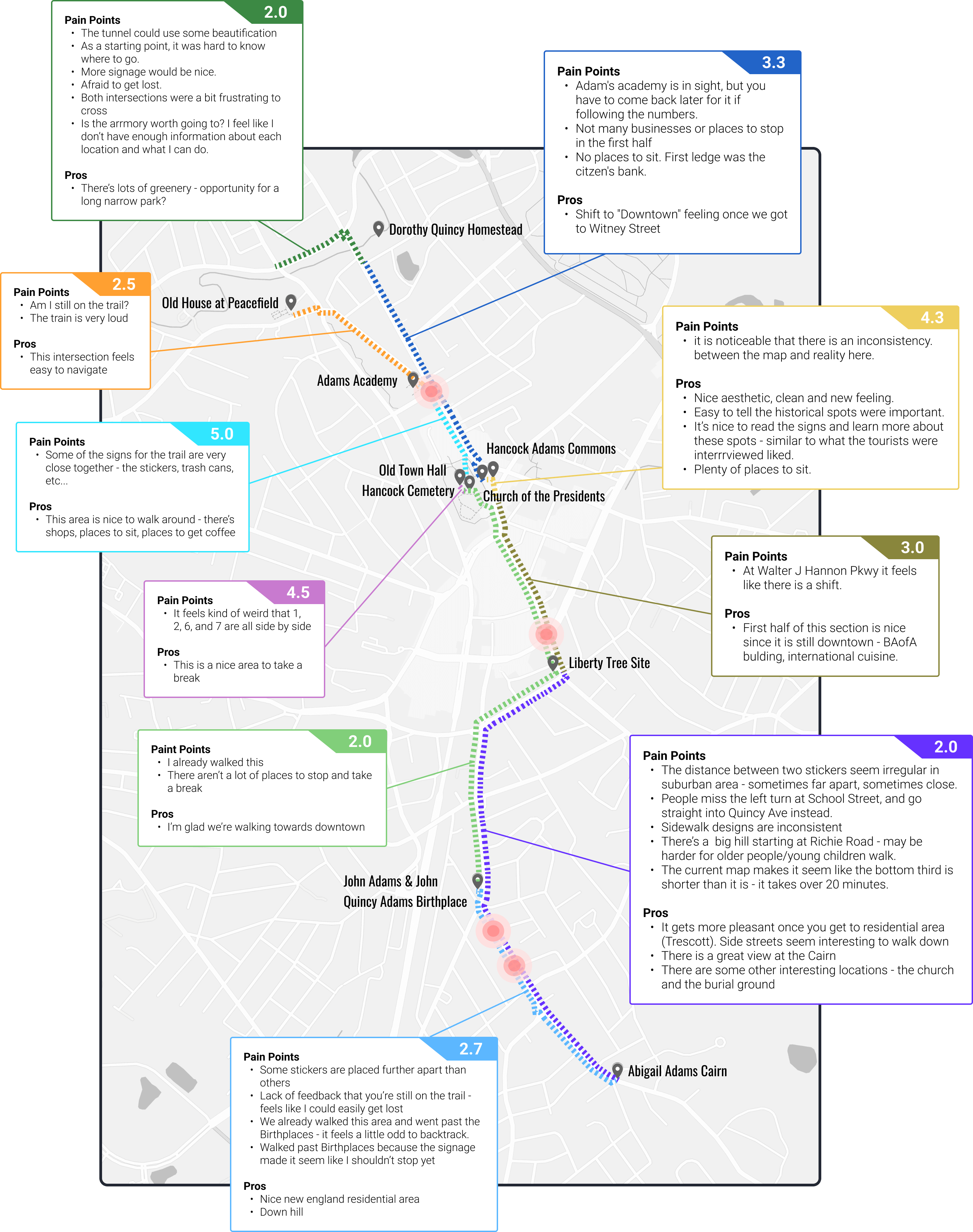
While most members of our group had walked portions of the trail, we decided to take a more deliberate and detailed approach by documenting our experiences walking between each historical location on the trail. We took note of things we saw, what we felt, and individual ratings (based on a 5 point scale). Afterwards, we took the average of our scores and synthesized our pros & cons into a diagram.

We found that there was a general lack of consistency - between the original map and the actual experience, between the placement of decals on the ground, and between the "feel" of different parts of the trail. Some areas felt more welcoming than others.
We also found that there were certain areas where we all would question if we were still on the trail, and there were multiple intersections where it was easy to loose track of where we should go.
The 4 red dots on the map indicate where we all felt there was a "point of transition," where the feel and surroundings changed.
Additionally, there were multiple locations along the trail where the decals had either completely come off or were about to, which made following them a little more difficult.
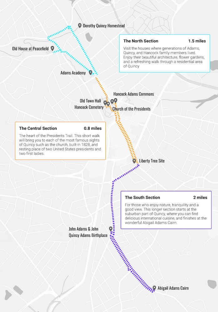
Through synthesizing our field research data we realized that it felt like there were actually 3 distinct sections to this trail which could be easily broken up along the top two points of transition (represented as red dots on the map above).
By presenting the trail as 3 sections with different and unique qualities, we can enable people to quickly understand what the overall experience is like and let them choose a section or multiple sections that fit within their interests, schedule, and physical constraints. We do this by showing descriptions of each section along with the time to walk them and the overall level of difficulty.
By defining the trail this way, this can also help us and the city strategize how to improve each section.

Our way of bringing these 3 sections to life included:
I focused on developing the map and trail blazers, while one team member worked on creating icons and the other concentrated on the murals.
An additional detail to note about our new map: we re-routed the trail in the North section away from Adams St and instead through Freedom Park. This does 3 things: First, it helps us create a more cohesive branding of this section as an area with lots of greenery and parks. Second, it increases accessibility - the sidewalks along Adams St are cracked and broken in areas, whereas the path through Freedom Park is not. Third, it’s an easy way to beautify the trail, which will help convince people to continue on to the next location.
As the design of the icons on the map were inconsistent, we felt it was important to create new ones. We did this by conducting a design studio workshop amongst our 3 team members, where we each spent 2 minutes sketching icon ideas for all 10 of the historical sites. Afterwards, we discussed why we drew each one the way we did and what we liked about each others sketches. From this workshop, we were able to synthesize what was important to include in each icon.
For the murals, we considered where we could strategically place them to beautify certain sections and inspire urban hikers to continue walking. We thought about permanent and temporary murals, and how temporary murals could be used as "pop-up" galleries in empty storefronts (this idea has been implemented in different European cities). We also considered what themes each mural could have, and how a contest could be a great way to find the best design while creating more awareness about the trail.
As the decals are a temporary solution, we thought it would be worthwhile to ideate on how to improve markings along the trail. During our observational study, we took note of what existing structures we could leverage in each section and found that trees, light poles, and electrical poles would be a good candidate. We realize that there is a potential complexity to this solution in that it's not always obvious who owns each pole, but we felt that eye level trail blazers may be worth the trouble as they can last longer than the decals and are cheap to implement.
At the end of the semester, we presented our project to the Mayor of Quincy, the President of the Quincy Chamber of Congress, and other members of city council that had been involved with the trail. Overall, the city was receptive to our ideas and particularly liked the notion of "chunking" the trail into 3 sections. They felt that this worked not only from a branding standpoint, but also from an implementation standpoint. Having 3 sections within one long trail would help them better strategize how to implement improvements. The city also expressed interest in implementing our other solutions but there is no specific timeline at the moment.
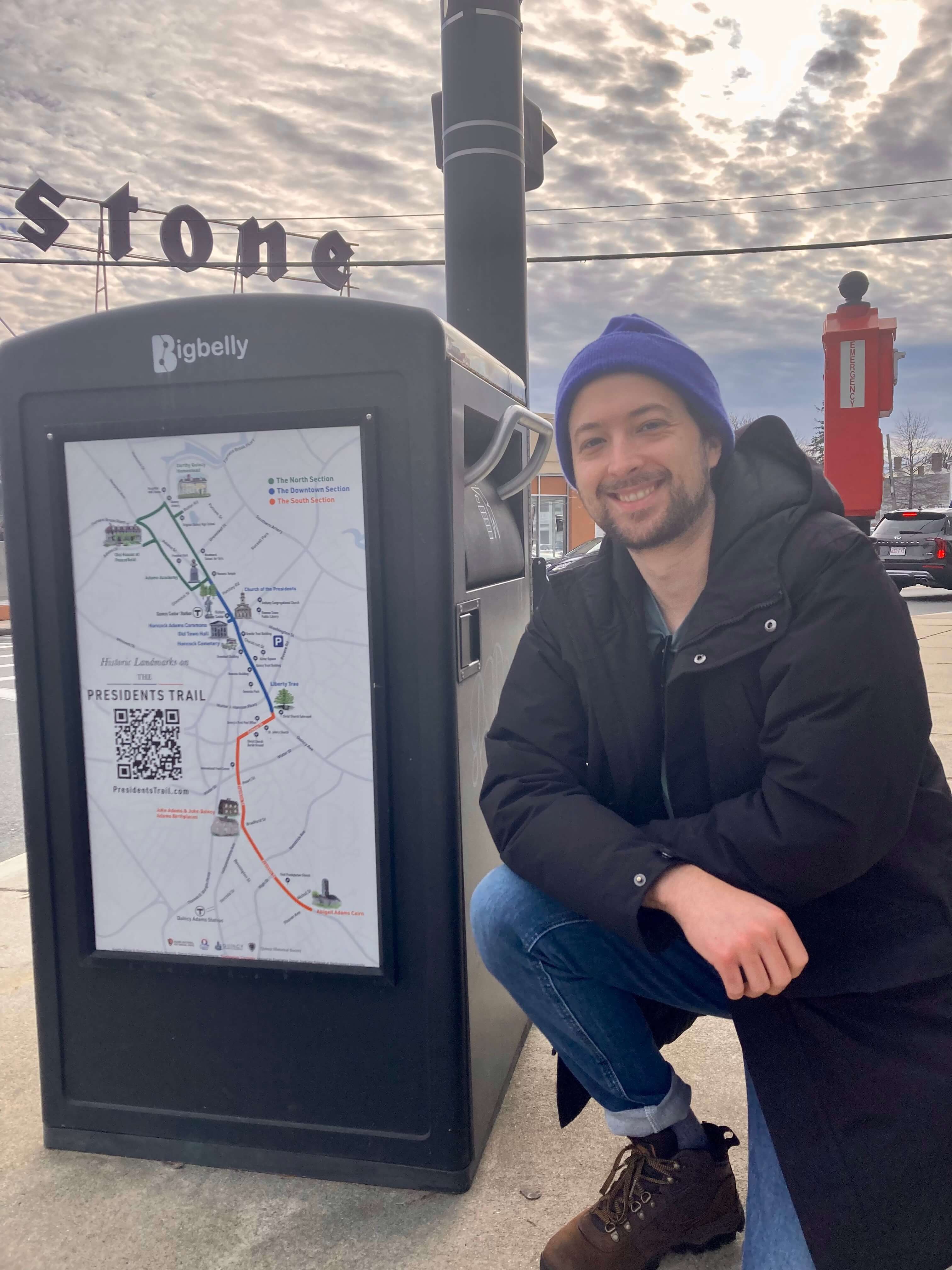
2022 update: In early March, the city informed us that they had implemented all of our suggestions for redesigning the map, which included rerouting the trail and presenting the trail as 3 distinct but connected sections. Additionally, the city also funded the publication of a book detailing our experiences which was released in April 2022.
Pictured below is me next to the map that now appears throughout the trail and downtown Quincy.
